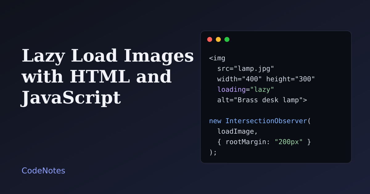
To lazy load images means letting the browser download a picture only when the visitor is about to see it. On a page with twenty photos, that can be the difference between a few hundred kilobytes and several megabytes before anything feels usable. It takes very little code, and it is also easy to do in a way that makes the page worse.
This tutorial covers two routes: the one-attribute native version you should reach for first, and an IntersectionObserver version for when you want control over the timing and a fade-in.
What you will build#
A gallery of twelve pictures under a sticky counter. Scroll down, and the counter goes up as each picture is requested, about 200px before it reaches the screen. Open the Network panel in your browser's developer tools while you scroll to watch the requests happen one by one.
The frame is small, so open the demo in its own tab to try it at full size.
Step 1: the native attribute#
Browsers can do this for you. Add loading="lazy" to the image and the browser postpones the download until the image is near the visible area.
<img
  src="/img/lamp.jpg"
  width="400"
  height="300"
  loading="lazy"
  decoding="async"
  alt="Brass desk lamp on a wooden desk">
Three details matter more than the attribute itself:
widthandheightgive the browser the image's proportions before a single byte arrives, so it can reserve the right amount of space. Without them the image is zero pixels tall until it loads, and everything below it jumps down. Keepimg { max-width: 100%; height: auto; }in your CSS and the attributes still provide the ratio.decoding="async"is a hint that the browser may decode the picture without holding up other work.- The browser decides how close is "near". That distance depends on the connection and is not something you can set. If you need to choose it, use the second version below.
The same attribute works on iframe elements, which is how the demo frames on this site avoid loading until you scroll to them.
One rule has no exceptions: do not lazy load the picture at the top of the page. The largest image on the first screen is usually the one that decides how fast the page feels. Leave it eager and tell the browser it is important:
<!-- Hero image: loads right away, with priority -->
<img src="/img/hero.jpg" width="1200" height="630" fetchpriority="high" alt="Desk with a lamp and an open notebook">
Step 2: lazy loading with IntersectionObserver#
Use JavaScript when you want to start loading earlier or later than the browser would, run code when a picture arrives, or fade it in. The browser API for this is IntersectionObserver. It tells you when an element enters the visible area, without a scroll listener running on every pixel.
The markup#
<!-- In the <head>: <link rel="stylesheet" href="/style.css"> -->
<header class="bar">
  <h1>Desk gallery</h1>
  <p class="counter" id="counter">Loaded 0 of 12 images</p>
</header>

<main class="page">
  <ul class="grid">
    <li class="card">
      <figure class="thumb">
        <img data-src="/img/lamp.jpg" width="400" height="300" alt="Brass desk lamp">
      </figure>
      <p>Brass desk lamp no. 1</p>
    </li>
    <!-- repeat for the other cards -->
  </ul>
</main>

<script src="/script.js" defer></script>
The image has no src. Its address waits in data-src, so the browser requests nothing until the script moves it across. The figure around the image is the box that keeps the card's shape while the picture is on its way.
The JavaScript#
const images = document.querySelectorAll("img[data-src]");
const counter = document.querySelector("#counter");
let loaded = 0;

function updateCounter() {
  counter.textContent = `Loaded ${loaded} of ${images.length} images`;
}

function loadImage(img) {
  img.addEventListener(
    "load",
    () => {
      img.classList.add("is-loaded");
      loaded += 1;
      updateCounter();
    },
    { once: true }
  );
  img.src = img.dataset.src;
  img.removeAttribute("data-src");
}

if ("IntersectionObserver" in window) {
  const observer = new IntersectionObserver(
    (entries, obs) => {
      for (const entry of entries) {
        if (!entry.isIntersecting) continue;
        loadImage(entry.target);
        obs.unobserve(entry.target);
      }
    },
    { rootMargin: "200px 0px" }
  );
  images.forEach((img) => observer.observe(img));
} else {
  // Very old browsers: no observer, so just load everything.
  images.forEach(loadImage);
}

updateCounter();
loadImage attaches the load listener before it sets src, so the event cannot be missed, even for an image that is already in the browser cache. Then it copies the address across and removes data-src, so the same image is never handled twice.
The observer calls its function with a batch of entries, one for each element whose visibility changed. Only the ones that are intersecting are loaded, and unobserve stops watching them, because each image needs handling just once.
rootMargin: "200px 0px" grows the observed area by 200px at the top and bottom of the screen. That is why a picture starts loading before the visitor reaches it, and with a decent connection it is already there when it scrolls into view. Raise the number for slow connections, or lower it to save more data.
The CSS that matters#
.thumb {
  margin: 0;
  aspect-ratio: 4 / 3;
  background: #e6e8ee;
}

.thumb img {
  display: block;
  width: 100%;
  height: auto;
  opacity: 0;
  transition: opacity 0.4s ease;
}

.thumb img.is-loaded {
  opacity: 1;
}

@media (prefers-reduced-motion: reduce) {
  .thumb img {
    transition: none;
  }
}
aspect-ratio holds the card at the right size while it is empty, and the grey background shows that something will arrive. The image stays transparent until the load event adds is-loaded, and the fade is switched off for people who asked their system for less motion.
Common problems and how to fix them#
The page jumps while images arrive#
The browser did not know how tall the image would be. Add width and height to every img, or give its container an aspect-ratio as above. The same idea protects whole cards, and the skeleton placeholder tutorial shows how to do it when text arrives late as well.
The main image at the top loads slowly#
It is probably lazy loaded. Remove loading="lazy" from anything visible on the first screen, and add fetchpriority="high" to the single most important image.
Some images never load#
An element with display: none never intersects the viewport, so the observer never sees it. Check that no parent hides the image, and that the script runs after the HTML exists. defer takes care of that. If your page has a scrolling container instead of scrolling the window, pass that element as the root option.
Nothing shows when JavaScript is off#
With data-src, no script means no image. Keep a real src plus loading="lazy" as the base and use JavaScript only for extras, or add a noscript copy of each image. Native lazy loading is safe here: when scripting is disabled, browsers load the image straight away instead.
Responsive images lose their srcset#
If your image uses srcset, move it to data-srcset and copy it over before the address, in the same function:
if (img.dataset.srcset) img.srcset = img.dataset.srcset;
img.src = img.dataset.src;
A picture fails and the card stays empty#
Listen for the error event the same way as load, and show a message or a fallback image. A grey box that never fills is the worst of both worlds, because the visitor cannot tell whether to wait.
Do not lazy load everything#
Lazy loading is for pictures below the first screen. A page with three images gains nothing from extra code, and a hero image that waits for a scroll event makes the page slower. Measure before you decide: open the Network panel, throttle the connection to a slow preset, and see which images are on the critical path.
For a real layout to try this in, the responsive product card grid is a good fit. Every card has a photo of the same shape, so the placeholder box and the lazy loading work together without extra effort.