An image comparison slider lets visitors drag a handle across two photos to reveal a before and an after. It is useful for edits, renovations, redesigns and charts, and it is a feature that is often built from a pile of mouse and touch event handlers. There is a simpler base: a native range input, which already knows how to be dragged, tapped and used with a keyboard.
This tutorial stacks two images, clips the top one with CSS, and lets an invisible range input do the controlling.
What you will build#
A living room shown in two states. The warm "After" version sits on the left of a divider and the grey "Before" version on the right. Drag the round handle, tap anywhere on the picture, or focus the handle and use the arrow keys, Home and End.
The frame is small, so open the demo in its own tab to try it at full size.
The markup#
<!-- In the <head>: <link rel="stylesheet" href="/style.css"> -->
<div class="compare" id="compare">
<img class="img img--before" src="/img/room-before.jpg" width="800" height="600"
alt="Living room before: grey walls, a dull grey sofa and an unlit lamp">
<img class="img img--after" src="/img/room-after.jpg" width="800" height="600"
alt="Living room after: warm walls, a teal sofa and a glowing lamp">
<span class="label label--after" aria-hidden="true">After</span>
<span class="label label--before" aria-hidden="true">Before</span>
<span class="handle" aria-hidden="true"><span class="grip">↔</span></span>
<input class="range" id="range" type="range" min="0" max="100" step="1" value="50"
aria-label="Comparison position">
</div>
<script src="/script.js" defer></script>
Everything lives in one box, .compare, and the layers are stacked in it:
- The "before" image is at the bottom and the "after" image sits on top. Both have real
widthandheightand a description inalt, because someone using a screen reader should be able to tell what changed. - The "After" and "Before" labels are
aria-hidden. They only repeat what thealttext already says. - The
handleis drawn by us and is alsoaria-hidden. It is only a picture of the control. - The
input type="range"is the real control. It has a name througharia-label, and it is the only thing a keyboard or a screen reader sees.
The CSS#
.compare {
  --pos: 50%;
  position: relative;
  aspect-ratio: 4 / 3;
  overflow: hidden;
  user-select: none;
}

.img {
  position: absolute;
  inset: 0;
  width: 100%;
  height: 100%;
  object-fit: cover;
  pointer-events: none;
}

/* The "after" photo is clipped from the right, so only the left part shows. */
.img--after {
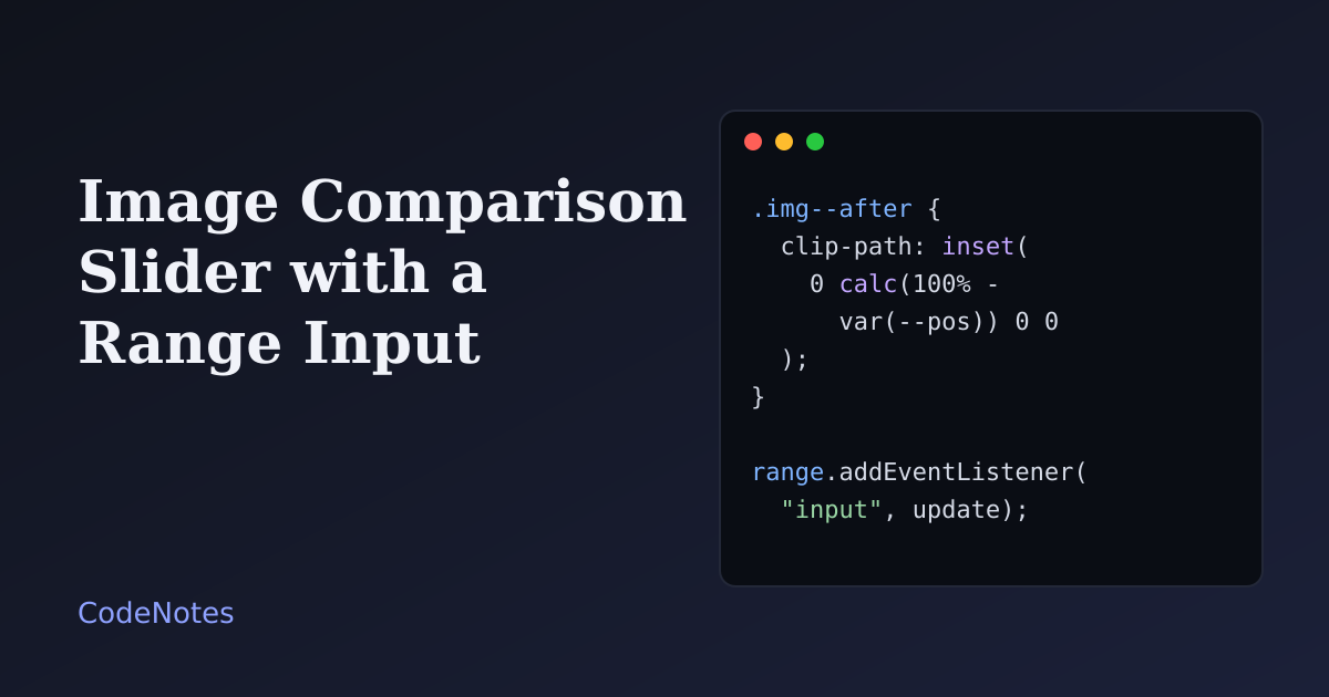
  clip-path: inset(0 calc(100% - var(--pos)) 0 0);
}

.handle {
  position: absolute;
  top: 0;
  bottom: 0;
  left: var(--pos);
  width: 3px;
  background: #fff;
  transform: translateX(-50%);
  pointer-events: none;
}

.grip {
  position: absolute;
  top: 50%;
  left: 50%;
  display: grid;
  place-items: center;
  width: 2.75rem;
  height: 2.75rem;
  border-radius: 50%;
  background: #fff;
  transform: translate(-50%, -50%);
}
One custom property, --pos, drives the whole effect. The top image uses it in clip-path: inset(...). The four values are top, right, bottom and left insets, and calc(100% - var(--pos)) cuts away everything to the right of the divider. At --pos: 50%, half of the picture is hidden. The divider and the grip use the same variable for left, so they always sit exactly on the cut.
The images also have pointer-events: none. Without it, the top image would catch every click and the input underneath would never get one.
Making the range input invisible and still working#
.range {
  position: absolute;
  inset: 0;
  width: 100%;
  height: 100%;
  margin: 0;
  opacity: 0;
  cursor: ew-resize;
  touch-action: pan-y;
  -webkit-appearance: none;
  appearance: none;
  background: transparent;
}

.range::-webkit-slider-runnable-track,
.range::-moz-range-track {
  height: 100%;
  background: transparent;
}

.range::-webkit-slider-thumb {
  -webkit-appearance: none;
  width: 1px;
  height: 100%;
  background: transparent;
  border: 0;
}

.range::-moz-range-thumb {
  width: 1px;
  height: 100%;
  background: transparent;
  border: 0;
}

.compare:has(.range:focus-visible) .grip {
  outline: 3px solid #2f46c8;
  outline-offset: 3px;
}
The input is stretched over the whole picture with inset: 0 and made transparent with opacity: 0, not display: none. It still receives every click, drag and key press, and it is still in the Tab order. The track is made as tall as the picture, so a click anywhere on the image lands on the control.
The thumb is made 1px wide. A normal thumb is a wide circle, and the browser keeps its edge inside the track, so the value would not match the pointer at the two ends. With a 1px thumb, a click at 25% of the width gives a value of 25, from one edge to the other, and the handle we draw lines up with it.
touch-action: pan-y tells touch browsers that a vertical swipe on the picture should still scroll the page, and only a horizontal drag controls the slider. Without it, a finger crossing the picture would get stuck.
The input is invisible, so the browser's own focus ring is invisible too. The last rule uses :has() to draw the ring on the grip when the input is focused with the keyboard.
The JavaScript#
const compare = document.querySelector("#compare");
const range = document.querySelector("#range");

function update() {
  compare.style.setProperty("--pos", `${range.value}%`);
  range.setAttribute("aria-valuetext", `${range.value}% of the after photo shown`);
}

range.addEventListener("input", update);
update();
That is the entire script. On every input event, which fires continuously while dragging, it copies the slider value into --pos. The browser re-clips the image, so there is no drawing code.
A range input reports only a bare number, and a screen reader would say "50". aria-valuetext replaces it with a sentence, so the visitor hears "50% of the after photo shown". The call at the end sets the starting state.
Common problems and how to fix them#
The two photos do not line up#
The images must show the same scene at the same size. Export both at the same dimensions, or crop them to the same aspect ratio. object-fit: cover stops the browser from stretching them, but it cannot fix photos taken from different positions.
Dragging scrolls the page on a phone#
Add touch-action: pan-y to the input, as above. If the whole page scrolled sideways instead, check that .compare has overflow: hidden.
The handle is slightly off at the ends#
You are using the real thumb as the handle. Its width keeps it away from the edges. Draw your own handle, as here, and make the real thumb 1px wide.
Keyboard users cannot see where they are#
An invisible input has no visible focus ring. Use :has(.range:focus-visible) to draw one on the handle. Do not remove outlines without putting a replacement in their place.
The arrow keys are too slow#
With step="1" an arrow key moves 1%. Raise step for coarser moves, or leave it. Home and End still jump to the ends, and Page Up and Page Down take larger steps in most browsers.
The screen reader only says a number#
Add aria-valuetext as in the script, together with an aria-label. If the images show something important, say what changed in the alt text of both.
The page has many sliders and loads slowly#
Every slider needs two images. Give the ones below the first screen loading="lazy", as the lazy loading tutorial explains, and keep the first slider eager if it is the largest picture on the page.
Where it stops#
This slider compares two images of the same size. For a comparison of more than two states, tabs are the better control: see the accessible tabs tutorial. Like the star rating input, the slider works because it restyles a native control instead of building a custom one, so keyboard and touch support are already there. Keep the handle white with a shadow rather than tying it to a theme color. It then stays visible on any photo, even if the rest of the page follows the theme as in the dark mode tutorial.