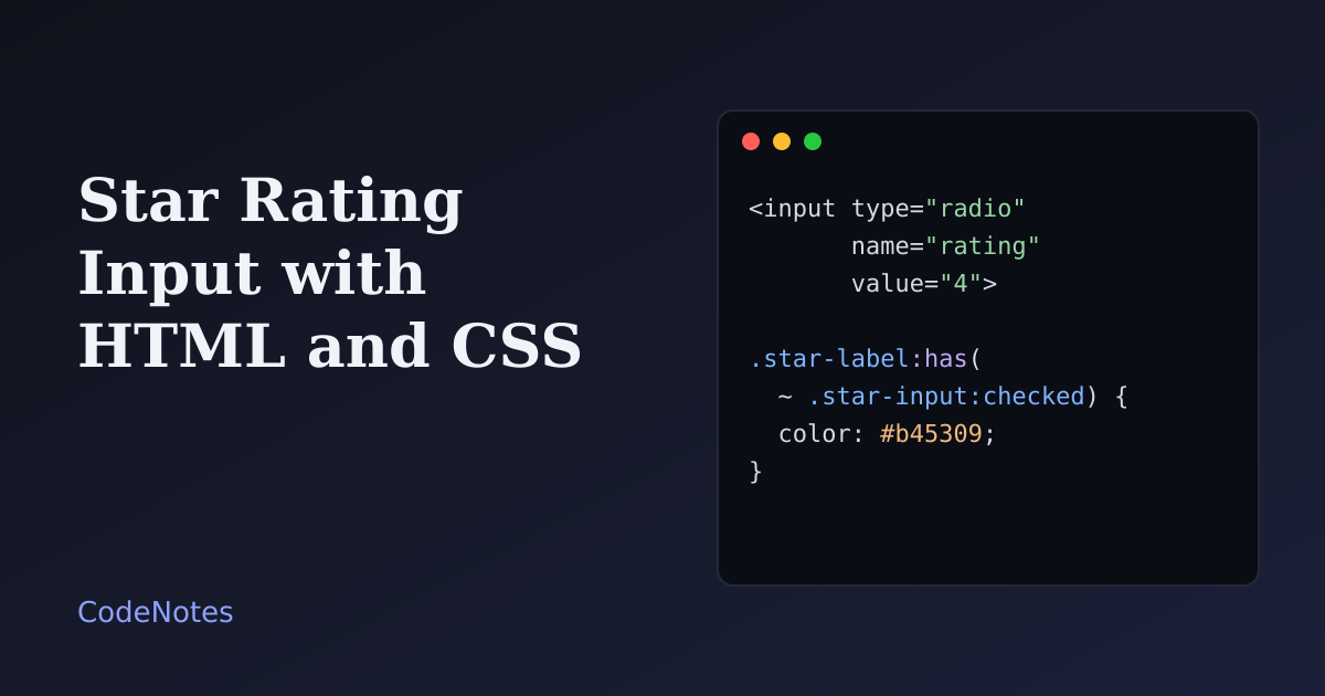
A star rating input is a row of five stars that a visitor clicks to score something. The accessible way to build one is not with spans and click handlers but with radio buttons. They already give you keyboard support, grouping and form submission, and CSS can turn them into stars without a line of JavaScript.
This tutorial builds that, plus a read-only version for showing an average, and then covers the mistakes that break the keyboard or the screen reader experience.
What you will build#
A product page with an average rating at the top, shown as stars filled to 4.3 out of 5, and a form below it where the visitor picks a rating. Hover over the stars to preview, click to choose, and use the Left and Right arrow keys once the row has focus.
The frame is small, so open the demo in its own tab to try it at full size.
The markup#
<!-- In the <head>: <link rel="stylesheet" href="/style.css"> -->
<form id="review">
  <fieldset class="fieldset">
    <legend class="legend">Your rating</legend>
    <div class="stars">
      <input class="star-input" type="radio" name="rating" id="star1" value="1" required>
      <label class="star-label" for="star1"><span class="visually-hidden">1 star</span><span aria-hidden="true">★</span></label>

      <input class="star-input" type="radio" name="rating" id="star2" value="2" required>
      <label class="star-label" for="star2"><span class="visually-hidden">2 stars</span><span aria-hidden="true">★</span></label>

      <!-- stars 3, 4 and 5 follow the same pattern -->
    </div>
  </fieldset>
  <button type="submit">Send rating</button>
</form>
Why this is the right structure:
- Radio buttons with the same
nameare one control. Only one can be selected, and the arrow keys move between them. You write no keyboard code at all. - The
fieldsetandlegendgive the group a name, so a screen reader says "Your rating, group" before it reads the options. - Each label has real text, "1 star", "2 stars" and so on, in a visually hidden span. The star symbol itself is
aria-hidden, because a screen reader would otherwise read it as "black star". The visitor hears the number they are choosing. requiredon the radios makes the browser refuse to submit until one is picked. It is enough on one radio of a group, but putting it on all of them is harmless.
The CSS#
/* The stars are written 1 to 5 in the HTML, in the same order as on screen, so the
   Left and Right arrow keys move the way people expect. */
.stars {
  display: inline-flex;
}

.star-input {
  position: absolute;
  width: 1px;
  height: 1px;
  margin: -1px;
  opacity: 0;
}

.star-label {
  padding: 0.1rem 0.15rem;
  color: #c9ced8;
  font-size: 2.2rem;
  line-height: 1;
  cursor: pointer;
}

/* The checked star, and every star before it */
.star-input:checked + .star-label,
.star-label:has(~ .star-input:checked) {
  color: #b45309;
}

/* Hover preview, only on devices that really hover */
@media (hover: hover) {
  .stars:hover .star-label {
    color: #c9ced8;
  }

  .stars:hover .star-label:hover,
  .stars:hover .star-label:has(~ .star-label:hover) {
    color: #b45309;
  }
}

.star-input:focus-visible + .star-label {
  outline: 3px solid #2f46c8;
  outline-offset: 2px;
  border-radius: 6px;
}

.visually-hidden {
  position: absolute;
  width: 1px;
  height: 1px;
  overflow: hidden;
  clip: rect(0 0 0 0);
  white-space: nowrap;
}
The radio inputs are hidden with opacity: 0 and a tiny size, not with display: none. A hidden-by-display input leaves the Tab order and the accessibility tree, and the keyboard would no longer reach the rating. This way the input is still there and still focusable, and the label is the part people see.
The filling is the interesting part. :has() lets a label ask whether a checked radio comes after it. .star-label:has(~ .star-input:checked) matches every label that is followed by a checked input, which means every star before the chosen one. The chosen star's own label is matched by .star-input:checked + .star-label. Together they fill stars 1 to the choice.
Hover works the same way. First all stars reset to the empty color while the pointer is in the group, then the hovered star and all those before it are filled. That is why the preview can show a lower rating than the one already chosen. It is wrapped in @media (hover: hover) because on a phone a tap leaves :hover stuck on the last star touched, and the preview would look like a rating the visitor never made.
In a browser without :has(), only the chosen star is filled. The rating still works and still submits, which is a graceful way to fall short.
Showing an average rating#
A read-only display needs no inputs. One row of stars, with a gradient that stops at the right place:
<span class="stars-static" style="--value: 4.3" role="img" aria-label="Rated 4.3 out of 5">★★★★★</span>
.stars-static {
  font-size: 1.4rem;
  letter-spacing: 0.1em;
  line-height: 1;
  background: linear-gradient(
    90deg,
    #b45309 calc(var(--value) / 5 * 100%),
    #c9ced8 0
  );
  -webkit-background-clip: text;
  background-clip: text;
  color: transparent;
}
The text is five stars, and the background is a hard-edged gradient: amber up to 4.3 out of 5, grey after that. background-clip: text shows the gradient only through the shape of the stars. role="img" with an aria-label turns the whole thing into one image with a sentence, so a screen reader says "Rated 4.3 out of 5" and skips the five star characters. Always write the number as text next to it as well, as the demo does.
The JavaScript (optional)#
// The rating works without this file. The script only confirms the choice in words.
const form = document.querySelector("#review");
const status = document.querySelector("#status");

form.addEventListener("change", (event) => {
  if (event.target.name !== "rating") return;
  status.textContent = `You chose ${event.target.value} out of 5.`;
});
The input already works. This script adds a sentence in a role="status" paragraph, so people who cannot see the stars hear what they picked. Use it for confirmation, never for the core behavior.
Common problems and how to fix them#
The arrow keys go the wrong way#
You used the flex-direction: row-reverse trick, where the stars are written 5 to 1 in the HTML so a ~ selector can fill the earlier ones. It works visually, but the keyboard follows the HTML order. Pressing Right moves toward lower ratings. Write the stars 1 to 5 and use :has() as above, so the screen and the keys agree.
The keyboard cannot reach the stars#
The inputs have display: none or visibility: hidden. Hide them with the small, transparent technique above, and add :focus-visible styling on the label so keyboard users can see where they are.
The filled stars barely differ from the empty ones#
Two pale colors make a rating hard to read, and for some people impossible. Keep a contrast of at least 3:1 between the filled and the empty star, and check the filled star against the background as well. The demo's pair is about 3.2:1 in the light theme and well above that in the dark one.
The error message is the browser's default#
A missing rating shows a generic bubble. Customize it, and link it to the group, with the Constraint Validation API, the same way you would for a text field.
Half stars#
Whole stars are fine for input. For half stars, you need ten radios, or a different control altogether. For display, the gradient method above already handles any value, such as 4.3 or 4.5.
Adding rating structured data#
Do not add review or AggregateRating markup to a page unless the ratings come from real people and are visible on that page. Google's guidelines reject made-up or self-serving ratings, and a demo number like 4.3 above is for illustration only. Put real data behind it, or leave the markup out.
Where it stops#
A star rating collects an opinion, but it says nothing about why. If the rating matters, pair it with a text field. Once you have real averages, show them on every card of the responsive product card grid, and confirm a submitted rating with a short toast notification instead of replacing the form.