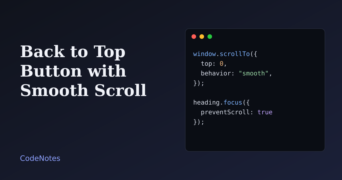
A back to top button saves readers from dragging the scrollbar all the way up a long page. It is also easy to get wrong: it covers content, it animates for people who asked for no animation, and it leaves keyboard focus stranded at the bottom of the page.
This tutorial builds a button that appears only when it is useful, scrolls smoothly unless the visitor prefers otherwise, and moves focus along with the page.
What you will build#
A long page of reading notes. Nothing shows on the first screen. After about 400px of scrolling, a round Top button fades in at the bottom right. Click it, or tab to it and press Enter, and the page returns to the top with focus on the heading.
The frame is small, so open the demo in its own tab to try it at full size.
The CSS-only version#
Before writing any script, know that a link and two lines of CSS already solve most of it:
<h1 id="top">Reading notes</h1>
<!-- long page -->
<a class="to-top" href="#top">Back to top</a>
@media (prefers-reduced-motion: no-preference) {
  html {
    scroll-behavior: smooth;
  }
}
The link jumps to the element with id="top", and the browser carries keyboard focus order along to that spot. Wrapping scroll-behavior in the media query means the smooth scroll only happens for visitors who have not asked for reduced motion.
This is a good answer for short and medium pages. What it cannot do is stay hidden until it is needed. The rest of this tutorial adds that.
The markup#
<!-- In the <head>: <link rel="stylesheet" href="/style.css"> -->
<body>
  <main class="page">
    <h1 id="top" tabindex="-1">Reading notes</h1>
    <!-- long content -->
  </main>

  <div id="sentinel" aria-hidden="true"></div>
  <button class="to-top" type="button" aria-label="Back to top">
    <span aria-hidden="true">↑</span> Top
  </button>

  <script src="/script.js" defer></script>
</body>
tabindex="-1" on the heading lets a script move focus to it, without adding it to the Tab order. The sentinel is an invisible marker that the script watches. The button is a real button, so it works with Enter and Space for free. Its accessible name, "Back to top", contains the visible word "Top", which matters for people who control the page by voice and say what they see on the button.
The JavaScript#
const button = document.querySelector(".to-top");
const sentinel = document.querySelector("#sentinel");
const heading = document.querySelector("#top");

// Show the button once the sentinel has scrolled out of view above the screen.
if ("IntersectionObserver" in window) {
  const observer = new IntersectionObserver(([entry]) => {
    const scrolledPast = !entry.isIntersecting && entry.boundingClientRect.top < 0;
    button.classList.toggle("is-visible", scrolledPast);
  });
  observer.observe(sentinel);
} else {
  button.classList.add("is-visible");
}

button.addEventListener("click", () => {
  const reduceMotion = window.matchMedia("(prefers-reduced-motion: reduce)").matches;

  window.scrollTo({ top: 0, behavior: reduceMotion ? "auto" : "smooth" });

  // Move focus too, so the next Tab press starts from the top of the page.
  heading.focus({ preventScroll: true });
});
The sentinel is a better trigger than a scroll listener. The browser tells the observer when the marker enters or leaves the screen, so no code runs on every pixel of scrolling.
The line to study is scrolledPast. A marker that is "not intersecting" could be above the screen or below it. On a short phone screen it starts below, and the button would wrongly appear on load. Checking that boundingClientRect.top is negative confirms that the visitor has scrolled past it.
On click, the script reads the reduced motion setting at that moment and chooses "auto" (an instant jump) or "smooth". Then it moves focus to the heading. preventScroll: true is important: without it the browser would jump to the heading immediately and cancel the smooth scroll.
The CSS that matters#
body {
  position: relative;
}

#sentinel {
  position: absolute;
  top: 400px;
  left: 0;
  width: 1px;
  height: 1px;
  pointer-events: none;
}

.to-top {
  position: fixed;
  right: 1rem;
  bottom: calc(1rem + env(safe-area-inset-bottom));
  min-width: 2.75rem;
  min-height: 2.75rem;
  opacity: 0;
  visibility: hidden;
  transform: translateY(8px);
  transition: opacity 0.2s, transform 0.2s, visibility 0.2s;
}

.to-top.is-visible {
  opacity: 1;
  visibility: visible;
  transform: none;
}

@media (prefers-reduced-motion: reduce) {
  .to-top {
    transition: none;
    transform: none;
  }
}
The 400px in top decides when the button appears. Hiding uses visibility, not only opacity. A transparent button is still focusable, and a keyboard user would land on a control they cannot see. visibility: hidden removes it from the Tab order and from screen readers until it is shown.
env(safe-area-inset-bottom) keeps the button clear of the home indicator on phones with a rounded screen, and the 2.75rem minimum gives a comfortable target for a thumb.
Common problems and how to fix them#
The button appears as soon as the page loads#
The script treated "not intersecting" as "scrolled past". Keep the boundingClientRect.top < 0 check, and keep the sentinel as a direct child of body so the 400px is measured from the top of the page and not from some positioned wrapper.
The button covers something#
Chat widgets, cookie notices and toasts all want the bottom corner. Move the button before covering one of them. If you also show messages like the ones in the toast notifications tutorial, put the stack on the opposite side or lift the button while a toast is visible.
Smooth scrolling feels slow, or makes someone dizzy#
Do not set scroll-behavior: smooth for everyone. The media query in the CSS-only version and the matchMedia check in the script both respect the visitor's setting. Test it: switch on reduced motion in your operating system, and the jump should be instant.
The heading ends up behind a sticky header#
When a fixed or sticky header covers the top of the page, give the target scroll-margin-top equal to the header's height. If you are building one, the responsive navbar tutorial has a header you can make sticky.
The button does not match the dark theme#
Do not hard-code its colors. Give the button the same CSS variables as the rest of the page, as the demo does, and it follows the theme. The dark mode toggle tutorial shows how to set that up.
The focus outline is missing#
Never remove it without a replacement. The demo uses :focus-visible with a thick outline, so the ring shows for keyboard users and stays quiet for mouse clicks.
When not to add one#
Skip the button on short pages. A control that appears on every page teaches people to ignore it. It also does not fix infinite scrolling: if new content keeps loading as you scroll, the footer is unreachable, and a button to jump to the top only makes the page feel longer. For long lists, a "Load more" button and a footer that stays in reach is a kinder pattern.